Insight
January 6, 2026


For years, the ViewPager and its successor, ViewPager2, were the standard-bearers for creating swippable layouts in Android development. Using the traditional XML-based system, implementing a carousel or a multi-tab onboarding flow required a significant amount of boilerplate: defining FragmentStateAdapter or PagerAdapter classes, managing fragment lifecycles, and carefully hooking into XML layouts.
For years, the ViewPager and its successor, ViewPager2, were the standard-bearers for creating swippable layouts in Android development. Using the traditional XML-based system, implementing a carousel or a multi-tab onboarding flow required a significant amount of boilerplate: defining FragmentStateAdapter or PagerAdapter classes, managing fragment lifecycles, and carefully hooking into XML layouts.
With the shift toward Jetpack Compose, the need for a more intuitive, declarative way to handle horizontal and vertical swiping became apparent. The Compose Pager — now part of the stable Foundation libraries — replaces the rigid adapter-based system with a flexible, state-driven model. Instead of juggling adapters and fragments, developers can now define paginated content using simple Composable functions. This not only aligns with the modern reactive programming paradigm but also makes features like synchronized animations, custom page transformations, and dynamic content loading significantly easier to implement. With the inherent flexibility of Compose, we can do more with far less effort, turning what used to be a complex architectural task into a concise and readable implementation.
Getting Started: The Setup
To use Pagers in your project, ensure you are using a modern version of the Compose BOM (Bill of Materials). As of January 4, 2026, the latest stable release is:
For better scalability and readability, using Version Catalogs (libs.versions.toml) is highly recommended in modern Android projects. This centralizes your dependency management and ensures consistency across multi-module projects. By including the Foundation library via your preferred setup, you gain access to the HorizontalPager and VerticalPager composables.
Basic Implementation
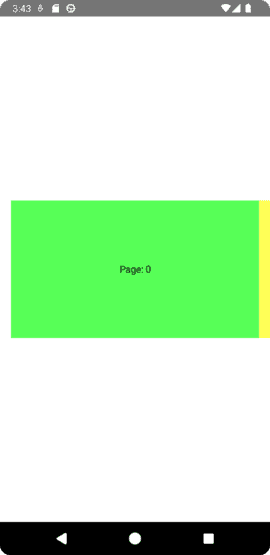
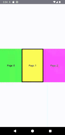
The core of a Pager is the PagerState, which tracks which page is currently visible and handles the scrolling logic. You initialize this using rememberPagerState.
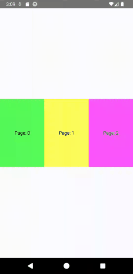
Here is how you can implement a simple horizontal swipe view:

If your design requires vertical scrolling — common in full-screen video feeds or document viewers — you simply swap the component for a VerticalPager:

Deep Dive into PagerState
Both HorizontalPager and VerticalPager rely on PagerState to function. This state object is incredibly powerful; it allows you to listen to the current screen, define the total page count, set the starting page, and even programmatically trigger page changes.
Here is the official signature for the rememberPagerState function:
In most use cases, you’ll only need to provide the initialPage and the pageCount lambda. The initialPageOffsetFraction is best left at its default 0f unless you have a specific requirement for the initial scroll alignment.
Controlling the Pager Programmatically
Because Compose is state-driven, you can easily add external controls like “Next” and “Previous” buttons. Since scrolling to a page is a “suspend” operation (it involves an animation over time), you’ll need a CoroutineScope to trigger these actions.

Maintaining State with Keys
When dealing with dynamic content — where items might be added, removed, or reordered — using the key parameter is essential. By default, the Pager uses the item's position as its key. However, if you insert an item at the beginning of your list, the positions of all subsequent items change, which can lead to the scroll position jumping or state being lost.
By providing a stable and unique key, you ensure the scroll position is maintained based on that key. If items are added or removed before the current visible item, the Pager uses the key to keep the correct item visible.
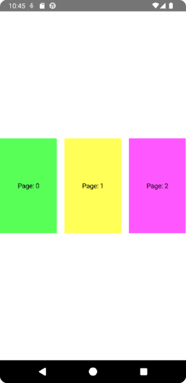
Controlling Page Size
By default, a Pager assumes that its content should fill the entire available space in its scroll axis.

While it might seem like this behavior is caused by fillMaxWidth(), the issue is deeper. Even if you assign a fixed width (e.g., 200.dp) to the page content, the Pager still treats that element as the 'full page' unit, stretching the layout or alignment to match the pager's swipe boundaries

This behavior exists because the pageSize parameter defaults to PageSize.Fill. To display multiple items or items with a specific size, you must change this parameter to PageSize.Fixed

or a custom implementation.
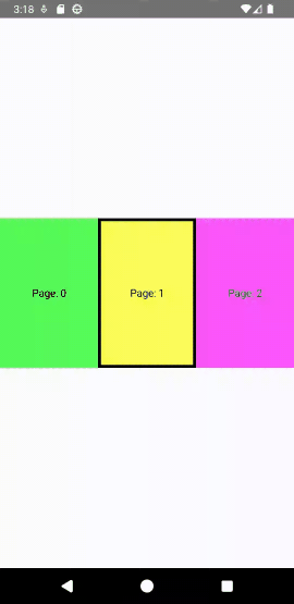
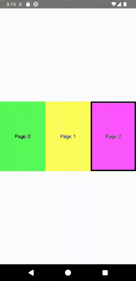
Snap Position: Aligning Your Content
When you have multiple pages visible on the screen at once (using a custom PageSize), where the pager "snaps" becomes very important. By default, the snap position is SnapPosition.Start, meaning the "current" page will align with the beginning of the pager container.
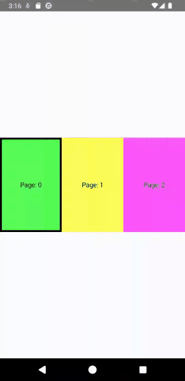
As you can see, the snap is placed to the start of the viewport. However, Compose gives you the flexibility to change this alignment to suit your design. You can center the active page using SnapPosition.Center or align it to the end using SnapPosition.End.
Content Padding and Page Peeking
Another vital parameter is contentPadding. As defined in the documentation, it adds padding around the whole content after it has been clipped. This is distinct from using a standard Modifier.padding() on the Pager itself, as it allows you to add spacing specifically at the start or end of the scrollable content.
One of the most common use cases for contentPadding is to allow the next (and previous) pages to "peek" onto the screen. This signals to the user that there is more content to explore.
When you apply a horizontal padding like 16.dp, the Pager reduces the width available for the "current" page just enough to let a sliver of the neighboring pages show at the edges. Note that this padding applies to all pages; if you use a vertical pager, you would apply vertical padding to achieve a similar "peeking" effect from the top or bottom.
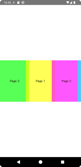
Page Spacing
While contentPadding affects the outer edges of the pager content, pageSpacing is used to define the gap between individual pages. This is purely for the internal gutter between items and does not affect the outer bounds of the first or last page.
Interestingly, you can even use negative values for pageSpacing. If you set something like pageSpacing = (-16).dp, the pages will actually overlap each other. This can be used for creative stack-like animations or stylized card layouts.
Lazy Loading and Performance
Pages in both HorizontalPager and VerticalPager are lazily composed and laid out only when required. This is a core performance feature: as the user scrolls, the pager removes any pages that are no longer needed, keeping memory usage low.
By default, the pager only loads the pages that are currently visible on the screen. However, you can use the beyondViewportPageCount parameter to load pages off-screen ahead of time. This can make swiping feel smoother, as the next page is already composed and measured before it enters the viewport.
Managing Beyond-Viewport Pages
While it’s tempting to set a high count to ensure everything is “ready,” readers should be careful. Every page loaded beyond the viewport is still being composed, measured, and placed. Setting this count too high can lead to performance degradation, especially with complex page layouts.
Pagers even support dynamic changes for the beyond page count, allowing you to adjust it based on app state or user settings:
Dynamic Page Counts
Because the pageCount in PagerState is defined as a lambda, Pagers have no problem handling dynamic changes to the total number of pages. You can add or remove items from your data source, and the Pager will reactively update its scroll range.

Working with Paging 3
By extension, this dynamic capability makes the Pager component a perfect match for the Paging 3 library. When dealing with massive datasets from a network or database, Paging 3 handles the chunking and loading, while the Pager provides the UI.
First, include the dependency:
You can then define a PagingSource and collect those items within your Composable:

This setup ensures that you are only fetching data for the pages the user is actually browsing, combining the efficiency of Paging 3 with the smooth interactive experience of Compose Pagers.
Visual Transformations and Animations
One of the most powerful features of PagerState is its ability to provide real-time scroll information. Properties like currentPageOffsetFraction allow you to listen to exactly how far a page has moved from its snapped position.
By leveraging these updates, you can apply stunning visual transformations as the user swipes.
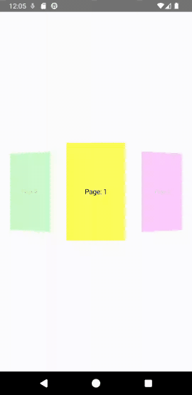
Basic Scaling Animation
A simple but effective technique is to scale the height of a page based on its distance from the center.

Advanced 3D Radial Transformation
For a more “premium” feel, you can use the graphicsLayer modifier to manipulate rotation, alpha, and scale simultaneously. This creates a radial, carousel-like effect.
Customizing Fling Behavior
Another critical aspect of the Pager experience is how it feels when a user “flings” or swipes quickly across the screen. By default, the flingBehavior of a Pager is configured with a PagerSnapDistance of 1. This means that no matter how hard you swipe, the pager will only move one page at a time.
However, for gallery views or fast-scrolling lists, you might want to allow users to skip multiple pages in a single gesture. You can customize this by defining a custom flingBehavior:
By setting PagerSnapDistance.atMost(3), the user can now snap up to three pages at a time with a single swipe, making navigation through long lists much faster and more engaging.
Summary
The transition from the legacy ViewPager to the Compose Pager represents a significant leap in developer productivity and UI flexibility. By embracing a state-driven model, we move away from complex adapter hierarchies and toward a declarative system where animations and data updates happen naturally.
Throughout this guide, we’ve seen how PagerState acts as the brain of your component—managing everything from simple scroll positions to complex 3D transformations. Whether you are building a simple onboarding flow with dynamic page counts, integrating large datasets with Paging 3, or crafting high-end bespoke animations using graphicsLayer, the Compose Pager provides a robust and scalable foundation. As you implement these patterns in your own projects, remember that the true power of Compose lies in its composability: these pagers can be nested, combined, and styled to fit almost any mobile experience you can imagine.
Love you all.
Stay tune for upcoming blogs.
Take care.